
UNDERSTANDING COLOUR
THE BASICS
How We See
We take our vision for granted but understanding the complexities of how we see colour is rather interesting. Without getting too technical it's useful to have an idea because I hope it will help illustrate and to appreciate how we capture and represent imagery for using different media. It also may help to understand why colour is different using different display devices such as CRT, LCD or a digital projector?
The retina is covered with light sensitive cells, known as rods and cones. Rods are more sensitive than cones but the rods help support vision in lower lighting conditions however they do not distinguish between colours. The cones fall into three categories sensitive to Red, Green and Blue light. The response to each individual colour overlap and the brain recognizes the different combination of signals from the individual R, G or B cone as a specific colour. So we can represent any colour by adding together the correct proportions or red, green or blue.
As each of us is individual, it would also correlate that everyone's eyes are completely different, more or less sensitive to luminance, hue or saturation. Some people even have colour blindness, where they have a colour vision deficiency, the inability to perceive differences between some of the colours others can distinguish. Remember those ink spots on cards when you were younger, that was testing for colour blindness, there are many different levels.
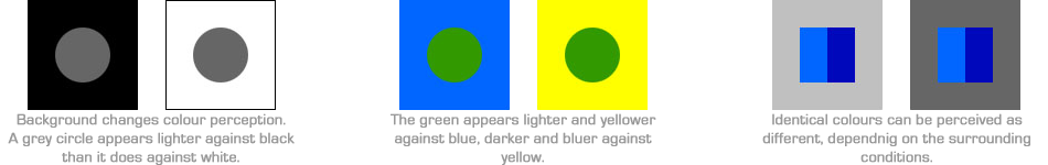
The colour space will define the available hues and shades, the eye, unlike film and television does not perceive colour in a persistent way, as we can interpret a colour depending on its situation.
Rods measure the intensity of light in the eye (greyness) and respond very little to colour. As light intensities vary so much, ranging from full sunlight to the near pitch-blackness of night, the need for such a mechanism is obvious. It also affords the detection of contrast. An analogy of this is similar to the controls of a black and white television. The "rods" will work whatever the intensity of light.
Cones are the colour receptors, and as their names suggest, are in the shape of a cone whose diameters reduce almost to a point. For this reason they are poor light receptors, but with enough illumination, the wavelengths coming into to eye can be separated in to their component colours. The signals are then sent along the optic nerve of the brain and interpreted as colour. The details on how our eyes do this in unnecessary, and chemically complex, for an understanding.
For night time observers much of the colour is lost to our eyes during the night. The simple reason is that cones have a threshold for colour sensitivity and below particular light energies (flux) almost all completely cease to work. Consequently, when we look at our surrounds during the night, we see only a slight range of "greyness". Looking through any telescope, we are immediately exposed to the illumination by the field stars and the astronomical object(s) in question. Most stars just appear white in colour, but in some circumstances like the very blue or very red stars, we do see some colour. Also the fainter the star or object the less colour we see, hence colour is also magnitude dependant. These colours we see are different from what we mostly see during our everyday living because at night we perceive very few hues. This is due to the colour component known as saturation that can be described as the degree of whiteness in any perceived colour. Saturation is fairly weak for stars. In astronomical objects these produce only pale colours and never intense ones. The only true exception is the deep-red carbon stars which have little blue or yellow light contributing to their spectra, but such stars are unusual and rare. Seeing colours at night with is unusual because we can see no more than about 10% Saturation. Experience finds that the more intense colours simply cannot be observed. The amount of saturation varies slightly between different individuals, and is visually dependant on the background colour it is seen against.

Subtractive / Additive Colour
In either a subtractive or an additive system, three primary colours are needed to match humans’ colour vision (caused by the three types of cone cells in the eye).
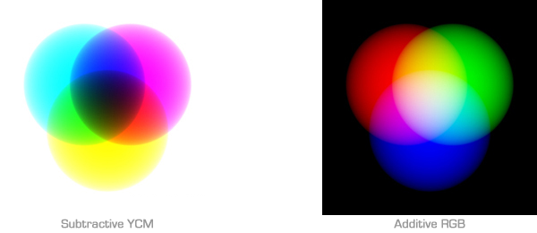
Subtractive colour systems start with white light. The secondary colours are formed by combining two of the primaries. Each combination is basically white light with one primary component missing.
Yellow, magenta and cyan filters or dyes absorb one primary colour each, if pairs of filters are overlapped in white light effectively leaving one. For example, Yellow and Magenta filters respectively absorb blue and green light, together they only transmit red light. All modern types of film, negative and positive, use this system of colour reproduction, with three dye layers coated one over another on a film base.
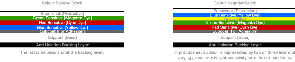
The three emulsion layers are led on top of each on a single base, acetate for negative and polyester for print stocks. They re all exposed and processed simultaneously. The image in a process colour negative is reversed in colour as well as density, just as bright areas appear dark in the neg and vice versa, green objects are represented by a Magenta image.
Colour Negative emulsions top layer is sensitive to blue light (forming a yellow layer on development). Immediately under this is blue absorbing filter (Yellow Filter) and below this are green sensitive and red sensitive layers. The filter layer is necessary to remove blue light, as these two lower layers happen to be sensitive to blue as well.
Colour Positive emulsions have the magenta forming green sensitive layer on top, the cyan layer is next and the yellow layer underneath. The slower finer grained magenta and cyan emulsion layers are not blue sensitive and so no yellow filter is needed.
In essence the colour dyes used in emulsion layers are not ideal for reproducing an accurately coloured image. The emulsion in the magenta for example is a little too yellow absorbing a small amount of blue light in addition to green. The point is that if left uncorrected, many colours would not be reproduced accurately.
Additive colour systems start with no light (black). An additive colour model involves light emitted directly from a source or illuminant of some sort, such as a projectors Xenon lamp. Combining all three primary lights (colour's) in equal intensities produces white light. Varying the luminosity of each light (colour) eventually reveals the full gamut of those three lights (colour's). Mixing Red & Green = Yellow, Green & Blue = Cyan, Blue & Red = Magenta.
Computer monitors and televisions use a system called optical mixing and cannot be considered additive light because the colours do not overlap. The red, green and blue pixels are side-by-side. When a green colour appears, only the green pixels light up. When a cyan colour appears, both green and blue pixels light up. When white appears all the pixels light up. Because the pixels are so small and close together our eyes blend them together, having a similar effect as additive light.
Understanding this technique will explain why each different viewing platform, even the same model will have different characteristics and brightness, therefore each display will have an individual and different look depending on how quickly they degrade over their individual life span - this is why look up tables per each individual monitor are a working necessity, this will be discussed in greater depth under Calibration.
Colours - Variation on a Theme
Above we talked of colour in its basic form by representing only its individual primary colours, Red, Green and Blue. When we are working with images from film, colour is measured by the density of the three dye layers. Where as in digital images, the red, green and blue's given values for the appropriate pixel, are represented as a numerical value ranging from 0 - 255.
When working with television, standard definition PAL & NTSC, the RGB components are encoded into new values YUV - Y represents the brightness or luminance, U and V are two chrominance or colour difference values, relating to the red and blue proportions of the total signal (there is no need to encode a third as two values will leave the third). Neither of these two different colour spaces mentioned (of which there are many more) describe the visual nature of colour.
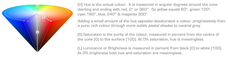
Film and Television colour space(s) are not exactly intuitive, therefore the colourist tends to refer to colour generically by its Hue, Saturation & Luminance values HSL. The Hue is the basic colour (or chrominance). Saturation (or purity) is the richness of colour and Luminance (Brightness) which is increasing the intensity of light in equal amounts - in essence you are adding RGB in equal amounts.
This scheme provides a device-independent way to describe colour. HSL may be the most complex scheme to visualize, especially since colour selection software has to reduce its three descriptive dimensions to two dimensions on the monitor screen. But once learned, it can be useful in many instances.
HSL [Hue, Saturation & Luminance]
The easiest way to visualize this scheme is to think of the H, S, and L values representing points within an upside-down cone. At the edge of the cone base, think of it as the full amount of dynamic range available.
The colour qualities may be described using the HSL terms, there are others that people use but HSL is accepted as a standard. Lighting, make up and the art direction can ultimately change the colour nuance(s) within the image captured: however grading, duplication and telecine transfers may all have an effect on the reproduction of a scene depending on the colourist. A scene may appear overall lighter or darker, or may have less contrast or be brighter than the DOP envisaged. Similarly the images may take on an overall cast of any hue, or appear less or even more saturated than anticipated. The point is that without direction, an introduced hue can be corrected out of the image, changing its ambience.
N.B. Remember optical grading can only affect the overall density and hue of the captured scene, where as using telecine or digital colour correction techniques, you can affect the image down to a singular pixel.
Device Dependant
Colours will be changed dramatically when going through conversion processes, which is why HSL has been adopted as a universal language. CMYK, RGB and YUV are all device dependant colour spaces, compression loss and distortion is a massive factor between systems, therefore it is better to adopt the highest resolution workflow for the intended output and only apply the changes at the end of the workflow, so that there are as few changes as possible. Remember, different viewing platforms will all have slight colour differences, from a projector or CRT, be it standard definition or a high definition monitor.